Indie

Indie is a bank account for freelancers that lets them focus on why they became self-employed in the first place. It automatically sets aside the right amount of money for taxes and has a debit card that instantly writes-off business expenses.
I was responsible for creating the first iteration of the brand. During this time I focused on brand expression, sentiment, and design.

I began by conducting a brand workshop to figure out who we were. I knew that we wanted to emphasize the carefree feeling of removing tax anxiety—like a massive weight had been lifted.

We came up with three guiding principles:
Tranquil, Transparent, Euphoric.

I explored logos from reductive to expressive—figuring out how to convey our three principles through visuals.

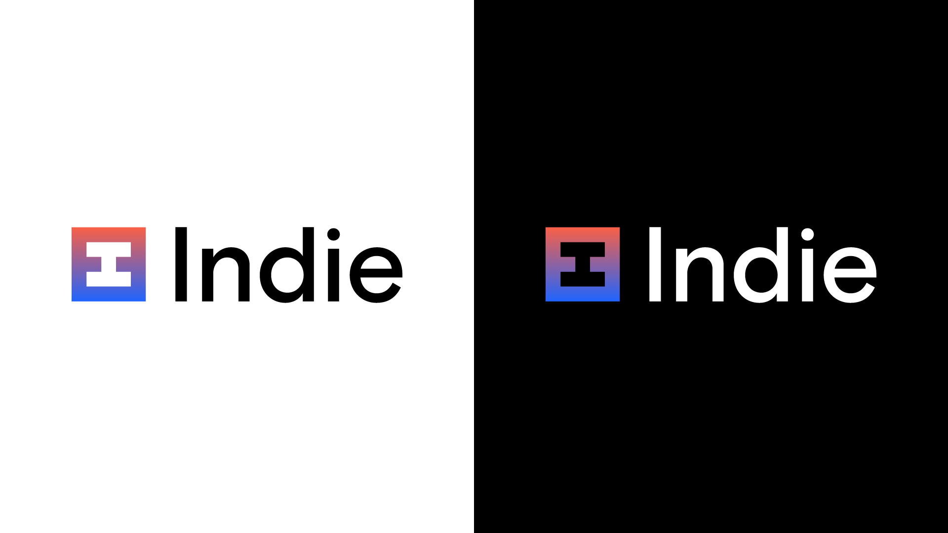
This is where the logo landed. We realized that our logo needed to be buttoned-up when talking about banking, but also stand back when being more expressive.

I developed this primary color palette and began introducing gradients to help reinforce the sense of euphoria.

We liked the versatility of the Basis Grotesque family. It does a great job standing alone as a headline, but also works well for body copy. We went with Basis Grotesque for primary type and Basis Grotesque Mono for accent type.

This is how the elements came together for various touch points.

Homepage

Emails for marketing, content, and product

App Icon

App Onboarding

The Product

Social
The initial direction for social:
Make write-off a mood.
I wanted to own “write-off” and have the creative match the excitement freelancers feel when they save money.

Product Design by Louis Harboe
Copy by Leigh Lucas
Motion by Justin Nambiar